For months, the yield curve has been doing what it always does before big commodity and energy moves: it started whispering before price started screaming.
This wasn’t a headline trade. This wasn’t a CPI print trade. This was a structure trade.
And it started with the yield curve.
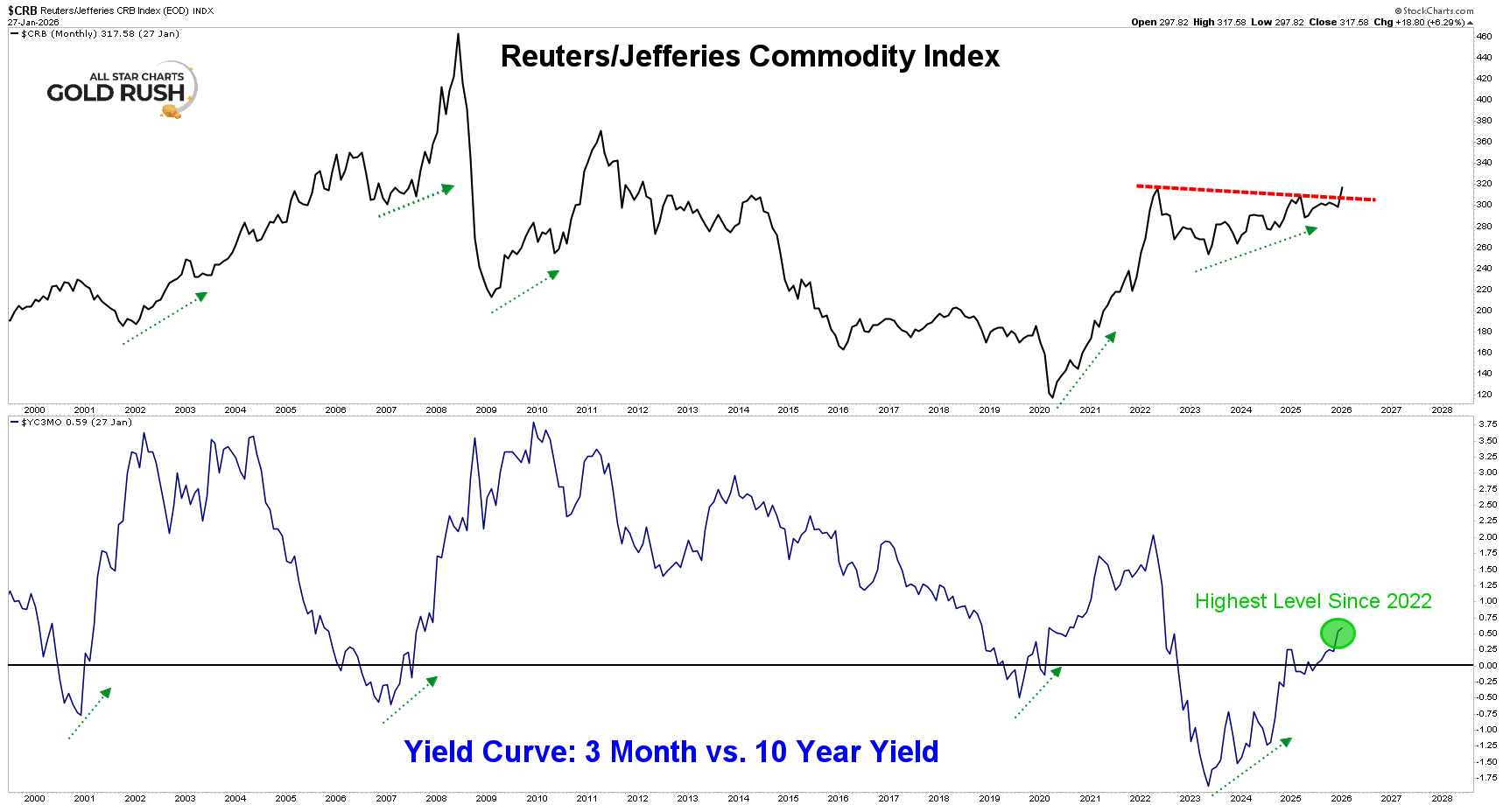
CRB vs. the Yield Curve — The Signal Before the Move
The first chart matters because it shows cause before effect.
The Reuters/Jefferies CRB Index is not some abstract inflation gauge. It’s heavily weighted toward energy — oil, gasoline, heating oil, and refined products dominate the index. When CRB moves, energy is usually doing the heavy lifting.
Now overlay that with the 3 month vs. 10 year yield curve as you see above.
Every major up-cycle in commodities over the last two decades has been preceded by the same setup:
The yield curve bottoms It starts to steepen Commodities follow That’s exactly what we’ve been watching unfold.
The yield curve has been pushing to its highest level since 2022, and that matters. Not because it “predicts” inflation headlines — but because it reflects liquidity, growth expectations, and risk appetite returning.
We’ve been updating members on this again and again. The message hasn’t changed:
When the curve turns, commodities don’t stay quiet for long.
Energy doesn’t lead every cycle — but when the curve steepens and reflation starts to show up, energy is usually early.
Supercycle Report highlights the breakout setups, rotations, and technical signals shaping metals markets — giving traders an edge in gold, silver, and commodities.