Free Newsletters
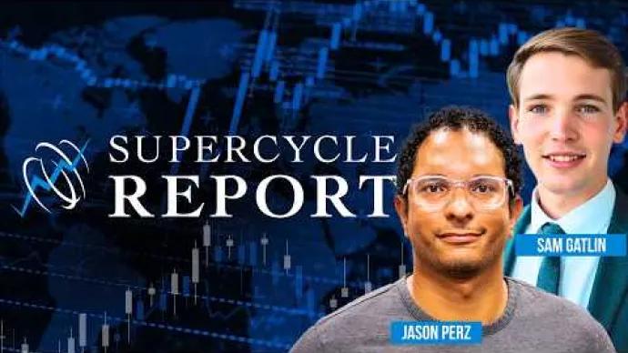
Supercycle Stocks
Free
Jason Perz and Sam Gatlin uncover the momentum shifts driving the current supercycle: precious metals, industrial metals, energy, chemicals, materials, and agriculture.
Stay Ahead of Every Major Move in Gold and Commodities
Latest Articles


Premium Products
Stock Market TV Shows
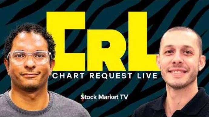
Supercycle Stocks Live
TV Show
Jason Perz and Sam Gatlin from All Star Charts Gold Rush break down their favorite charts and trades in the commodities and futures markets.